Salvo Grima
Rebranding and implementation
Rebranding and implementation
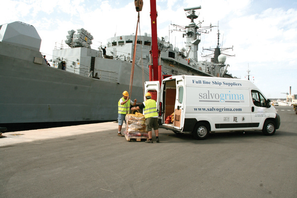
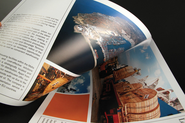
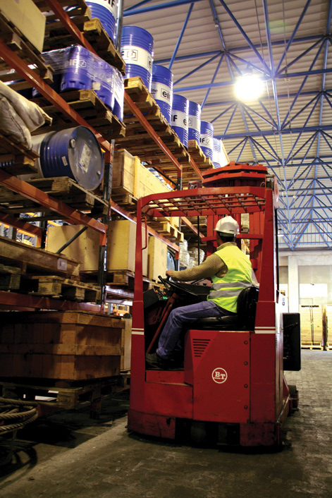
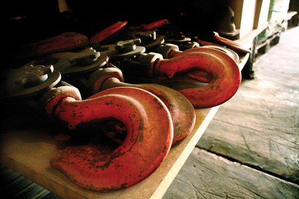
With a 150 year history under its belt Salvo Grima has reinvented itself from a ship supplies firm to a diverse collection of companies ranging from warehousing to retail. With the groups expansion happening in great part in the last decade, the image of the company had as yet to be updated to reflect this growth. With the anniversary looming, an extensive and year-long rebranding process that began with a brainstorming session with a few key people and expanded to a massive undertaking. The logo was reworked to retain their corporate blue, though a silver-grey was added to emphasise class and distinction. A classic font kept the nostalgic element to the otherwise modern new logo. This was applied not only to stationery but to promotional flyers, signage and vehicle livery, while extensive photoshoots and film sessions captured the daily operations of the group creating a versatile and comprehensive image library to be used in various media.